Do you mind shrinking down the image? Reddit cannot handle such big images. Make it 192 pixels tall please.
Yay! Now let me put it up!
EDIT: It's added.
I already did
@thirty Ok, this banner is the resized version of the current one, what do you think? ![]()
It's good! I like your art for the banner, especially the logo.
Extra super nice. ![]()
That looks great!
Thanks to everyone for giving appreciations to me, I forever be an art maker for r/SnapBerkeley! ![]()
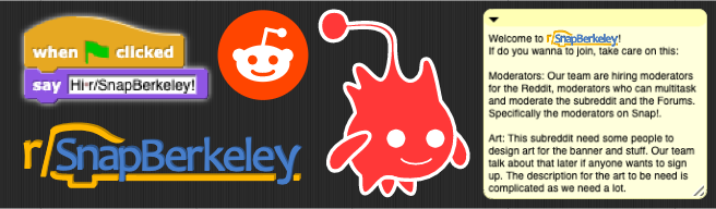
And that’s when, a legend, was born.
What if the emblem was the reddit logo with the Lambda, because right now it removes the distinction with Gobo.
@odysseus_ssb Hmmm... So do think about this... ![]()

Or this... ![]()

Thanks, because my birthday is on 24/09, it's so near. ![]()
I like this one better, but maybe remove the black line so it’s just half and half clean cut.
I like the approach at poking fun at the mascot of Snap!, so I'm happy with it.
Without the black line and added gradients... ![]()

@odysseus_ssb Is not only to poke fun to Alonzo, is to poke fun to Gobo. ![]()
(One more thing to say, your icon is a Jigglypuff head? So cute. ![]()
![]() )
)
I like it! But I think it may look better without the gradients if that’s possible. Thoughts on this being the logo everyone?
Ok, this version is the definitive. ![]()

Love it.
I would need more moderators (Because of school and such and me using a stupid school-issued chromebook that can't access Reddit)...