Edit: updated it
Fixed!

(@bh)
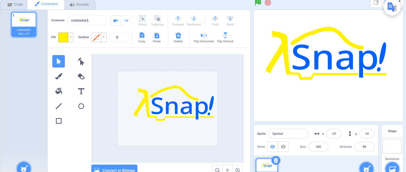
Good start. But the gap in the baseline is so that the descender of the "p" goes through it.
And the font is supposed to be Candara.
How good an approximation are you aiming for? The swoosh at the top is asymmetrical, leaning to the right. (Long left side, then an abrupt descent on the right.) If anything, Control blocks are the other way, with a gradual descent on the right.
ok ill see what i can do and did scratch add new fonts?
i spent an hour working on this one part lol, i dont think ill be changing that
i know..? Thats why i added it? lol
Thanks for the advice though!
ooh, i forgot the image would look different for everyone because its an svg file
edit: oh wait i dont think ill have to do that if i add in casandra. Ill see what i can do.
sooo theres no casandra font in google drawings...
OH, ITS CANDARA
Got it
You mean Candara? Also, pretty sure microsoft own the font, so you might not be able to find it on google fonts.
nope its on google drawings lmao

Ah, ok. If you have windows, it's probably already on your computer, but I'm pretty sure you're on chromebook, right?
yeah, chromebook.
I fixed it. This time its not text so it should be exact for everyone
Much better! The only thing is, the lower left corner of the lambda is hanging up in the air instead of being on the baseline.
(I wonder if you can't use a lambda from a font to make it perfect?)
Oh and it looks too widely spaced horizontally to me -- lots of space between letters. Is that an artifact of screen resolution?
i can fix that
Um I think thats just a google drawings problem
Huh, does your browser not have the font I used installed?
Its defaulting to Times New Roman when on mine its the original font i used?
Here was my attempt 8 months ago
Nice!
And that is what you should be seeing.
... except for the spacing of the letters!
I did my best too in a long time ago...
![]()
![]()