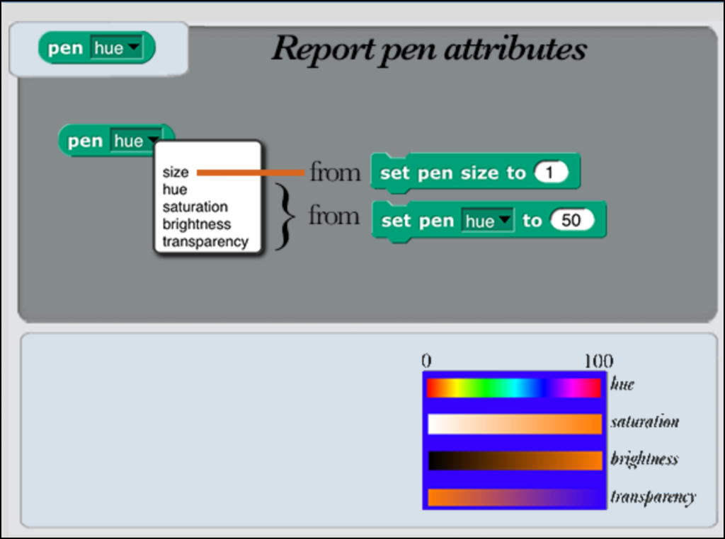
What are the color boundaries for the numbers reported by
![]()
For example:
0 - 8 Red
0 - 16 Orange
etc.
What are the color boundaries for the numbers reported by
![]()
For example:
0 - 8 Red
0 - 16 Orange
etc.
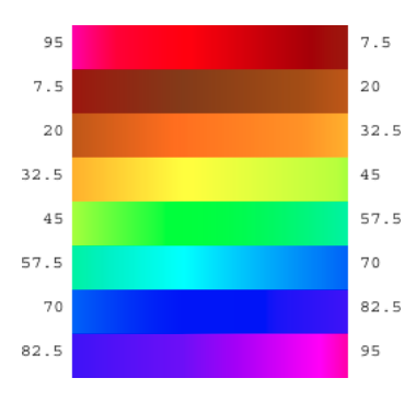
Sadly, it's the standard hue scale (rainbow), so there's hardly any orange or yellow, and a ton of green.
The concept of boundaries doesn't apply to colours
but
Red is Hue 0
Green is Hue 33.33333
Blue is Hue 66.66666
Yellow is Hue 16.66666
Cyan is Hue 50
Magenta is Hue 83.3333
anything in-between is in the eye of the beholder ![]()
Ah, I see, the goal of this scale is to have the three LEDs at each pixel of the screen equidistant on the hue scale. I guess that makes sense if you're building display hardware.
But I think people do think of the color names as representing ranges of hues rather than precise hues, hence my invention in the Colors and Crayons library of the "fair hue" scale in which each major color name gets an equal interval:
This numbering is complicated by my decision to promote brown to be a real color, even though it's not in the spectrum. Without that, there would be seven color names, and each row of the chart would be 14.29 hue values wide. So with red at 0, spectral green would be near 43, and spectral blue would be near 71.5 on the fair hue scale.
The big problem with the spectrum, of course, is the narrowness of orange, not one of the Big Six. That's why I want to spread it out (even more than fairness demands, if you consider brown to be just a shade of orange).
It could be argued that I should similarly spread out the right end of the spectrum, so that Violet and Magenta could each have a width equal to the other spectral color families. If I'd included both Magenta and Brown as full-fledged colors, there would be nine families, so the RGB hues would be 0, 44.44, and 66.66. Interestingly, that puts Blue exactly where it belongs on the real hue scale; it's just Green that's shifted, to make room for Brown and Orange.
P.S. Of course it's subjective what deserves to be a "real" color. I guess you could argue for Cyan/Teal and Lime/Green to be two color families each. But, you know, only interior decorators think that Teal is a color. As for the greens, confusingly spectral green is more like X11 Lime than like X11 Green.
P.P.S. Or Red/Maroon. But I adamantly claim that orange and brown are both color families in most English-speakers' minds, at least, in a way that maroon and teal and even cyan aren't. If you ask people to name colors it'll take them a while to get to those.
There have been a number of instances in Snap! that explore the intersection between art and music. We saw a demo in which a USB camera was moved across a painting to create a tune (or, at least, a sonic landscape). While we could map the RGB values to notes, we thought it might be interesting to extract color names - divided into five, seven, or twelve intervals that could ultimately be mapped to a pentatonic, major or minor scale, or the full Western chromatic scale - and then use the color names as inputs to notes.
Before we got very far along that path, we became interested in ways to divide up the color spectrum. Snap! lends itself that time of exploration ... and with color LED matrices that are available now, possibly even a light show outside the computer.
Thanks for all of the helpful background information, both in this strand, and in the reference manual.
huh. how is this topic in help with snap but not a subcategory?
Wasn't sure what the proper subcategory might be.
The best choice would be Help with Snap! > Snap! Editor, as this has nothing to do with the community site or forums. Also, the editor is where you can access this and therefore question it.
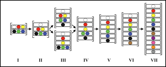
It appears that key research related to the color names originated with a monograph by Kay and Berlin, Basic Color Terms: Their Universality and Evolution (1969). A fifty-year retrospective identifies this work as the first systematic study of color naming across cultures. The key finding is that there are universal cross linguistic constraints on color naming. Basic color terms in different languages tended to correspond to very similar regions in color space. Moreover, while languages differed widely in the number of basic color terms, color terminology systems tend to add terms in a fixed order.
Berlin & Kay's evolutionary hierarchy of color term development found that as languages evolve, new color terms are acquired in a chronological sequence. If a basic color term is found in a language, then the colors of all earlier stages typically are present.
The physiological basis appears to be based on the three types of cone cells in the retina:
The brain appears to process signals from these three cone types to perceive the color spectrum. This is known as “trichromatic vision.” RGB displays appear to stimulate the three cone systems in different combinations to create the perception of millions of different colors. The color boundaries between colors seem to be based on how trichromatic vision divides the spectrum.
This is a complex system and this summary of some of the findings from key researchers no doubt over simplifies matters. But for us, at least, it provides a starting context for thinking about color spaces.
Kay and Berlin found the following color naming sequences across languages and cultures:
In Stage I of the color naming squence, two categories typically represent a dark cool partition (comprised of “black,”“green” and “blue”) and a light-warm partition (comprised of “white,”“red” and “yellow”).
In Stage 2, a “reddish” or “warm” category becomes distinct.
Stage III differentiates either “greenish-blue” or “yellow” categories.
In Stage IV both “greenish blue” and “yellow” categories are seen.
In Stage V a “blue” category is present.
Stage VI adds a “brown” category.
In Stage VII categories for “purple,”“pink,”“orange,”“gray” are realized.
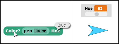
We created a block that reports color names:
Here's a link to the file:
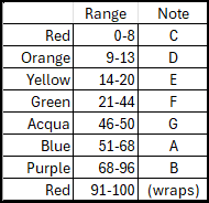
We used the following color ranges and plan to map to notes in a major scale, such as the C Major scale below. The ranges are obviously somewhat arbitrary, but at least we have a semi-logical rationale for the choices that we made. Thanks to everyone for the input and assistance!
Interesting, brown comes in before orange! Take that, Jadga! :~P
Shouldn't the hue scale be bounded at 360 instead of 100?
We are considering two possible color maps for the Pentatonic (five note) scale:
The chart below illustrates possible color mappings for these five note scales. We can't see an obvious reason to favor one over the other. Unless someone has a better suggestion, we may just choose by flipping a coin.
I see that you're looking for strongly visually distinguishable colors, and so maybe you should choose violet over aqua on the theory that everyone knows what violet is, whereas everyone thinks aqua is just a tint of blue.
But have you thought about Red, Orange, Yellow, Aqua, Blue, so that the gaps where F and B aren't stand out?
You could equally well ask why we don't bound all of them at 255. We're trying for something that'll feel familiar to people who aren't color theory experts but do know about, e.g., sprite graphic effects.
"But have you thought about Red, Orange, Yellow, Aqua, Blue, so that the gaps where F and B aren't stand out?"
That's a great suggestion - yes, we'll start with that alignment. (Thanks!)
We made a carousel with the Muybridge animated horses:
We plan to place colored dots around the edge of the carousel and point the web camera at them. As each colored dot moves past the camera, Snap! will play a corresponding note (using TuneScope).
We thought that the melody for the William Tell overture transposed into a pentatonic scale might provide a good accompaniment:
The spacing between punched holes in a music box paper tape determines the duration of notes (quarter notes, eighth notes, etc.) We are hoping to adapt this strategy to work out the timing for notes in this project.
Good choice! It's kinda funny that we associate that music with horses, because of the Lone Ranger; William Tell, as I recall, just stood in one place and shot an arrow. :~)
But your tempo is way too slow; it didn't sound right to me until I got up to 250 bpm. At first I thought the problem was that the notes needed to be staccato, but once I thought to change the tempo they were fine as is.
Also, I get why you chose the music box instrument, but that sounded wrong to me also, so I started playing around with instruments, and to my (untrained) ear, switching between piano and organ seems to transpose by an octave (by a pentagon?) -- piano more treble, organ more bass. The piano agrees with the music box. (I like it better in organ.)
PS Also, when I choose an instrument I haven't tried before, I miss hearing the first note. Do you load the instrument data dynamically? If so, maybe you need a preload block.