Already did that
Because of antialiasing? Can't you just, you know, anything darker than 50% gray is black, anything lighter is white? Even if the width ends up a pixel or two off, it'll be better than monospace.
No, because of the process of making it higher def. It increases the size of the letters, making it hard to calculate,
Hmm. I'll have to read the code, but you can't increase resolution beyond what's actually in the bitmap! You could interpolate values to smooth out jaggies (which is also what antialiasing does). But in any case, okay, calculate the width before you make it bigger.
I save the text as big, and shrink it when im writing it.
Okay, this isn't done, but here's my partial attempt at variable spacing:
This is at 50% scale rather than 20% so the text is big enough to see. :~)
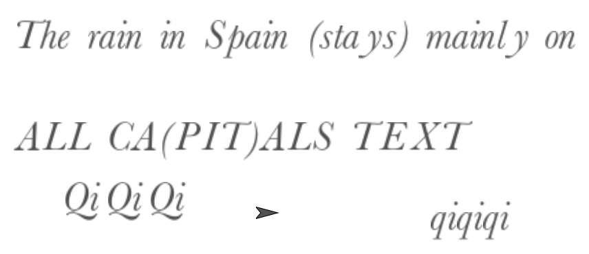
The thing that it took me forever to figure out, and I still don't really really understand, is that the rotation centers of your character costumes are at the right edge, on the baseline, and therefore... drumroll please... you have to do the CHANGE X BY before you do the STAMP. The result is that there's extra space to the left of that fancy capital Q (there weren't any space characters in the text, just "QiQiQi") but the "i"s go right where they should go. Similarly, there's too much space before the lower case "y" because of its fancy tail.
I'm thinking that the thing to do is compute the widths of only the parts of the costumes that are above the baseline. If you can figure out how to do that in the JS code you use to get the font, and store the above-baseline widths along with the costumes, that'd probably work well.
Why did you decide, by the way, to store the costumes in keyboard order instead of Unicode order? That would have made everything so much simpler!
P.S. I wrote a procedure to figure out the slant amount of a font by comparing the rightmost points near the top and near the bottom of the ! character. I thought I'd have to subtract that from the costume widths of italic fonts because the total costume width is greater than the baseline width, which is really what you want. But for some reason I don't understand, it works without that adjustment, and doesn't work with the adjustment. I can sort of see myself spending the next two years learning about fonts (on computers; I actually do know a thing or two about fonts in general because my high school had a print shop) the way I spent the last two years learning about colors.
(I guess I should add that my first real job after college was doing computerized typesetting of mathematical text, back before everyone had a 600dpi printer on their desk. I wrote code to position things like the radix in a cube-root (etc) sign correctly. I also invented something like the Unix shell pipe (|) feature, before there was Unix. It was fun.)
Once we get the basic spacing down, we get to think about kerning. If you have characters that line up just right, e.g., in the string "AW," they should be typeset with the costumes overlapping a little, since the part of the A that sticks out to the right doesn't overlap the part of the W that sticks out to the left. If you try printing STRAWBERRY in all caps, you'll see that the spacing doesn't look right without kerning. (That's what overlapping in these cases is called.) It's even worse when you're typesetting mathematics and you get something like L², for which the L and the 2 should overlap a lot. (But not too much; you could fit the entire 2 inside the L, but it has to stick out to the right of the L enough so that it's visually clear that the 2 comes after the L.)
Sorry, I'm a teacher, I get into these teaching moods... :~/
What was this? I don't mind reading the explanations written in a teaching mode.
(Gee, I haven't realized that you wrote 'mood(s)', not 'mode', until I started writing the reply.)
Oh, the typesetting process involved a bunch of steps, each of which was a separate program with an input and an output. It was my boss who invented the technique to connect the output from one to the input to another, but I wrote the command language that let you say what to connect to what. In the Unix shell you say
foo < inputfile | bar | garply > outputfile
where each of those is a program, foo takes its input from a file, but its output is connected to the input of bar, etc. That's not the notation I used, which I'm afraid I no longer remember.
Can't wait to learn about matrixes in school. (not sarcasm) ![]() this code is genius.
this code is genius.
Does each variable stand for something like BI = bold italic?
Well, here is my code (fixed by bh. Thanks!):
https://snap.berkeley.edu/snap/snap.html#present:Username=bh&ProjectName=JS%20Free%20Customizable%20Write%20Block
I'm crediting you both for my project. Unfortunately, for reasons the make sense, I can't put both your codes as solutions. : (
You can quote both and say it was a solution!
Oh yeah!
This is the solution. Thanks to @bh and @joecooldoo VERY MUCH for this. I think it will be helpful for everyone.
I said I was working on it.
If its going smaller, fine. But going Larger, It will get blurrier
The initial B is for Baskerville (my favorite typeface). So BI is Baskerville Italic, and BBI is Baskerville Bold Italic.
You're welcome. Are you going to try to get the widths only above the baseline? (I don't know how to determine where the baseline is... Oh wait, yes I do, because the rotation center is on the baseline! Aha, maybe I can do this... unless you'd rather?